As promise, on Monday, we have our first playable prototype working!
What we included in this build were
- Intro and outro with no voiceover (will add)
- A story happens in the lecture hall with
- 2 puzzles
- 2 types of microaggressions
- Background music and sound effects
Want to give it a try? We updated a newer version –
https://simmer.io/@Blindspot/chapter1demo
Also here’s the demo if you want to have quick look –
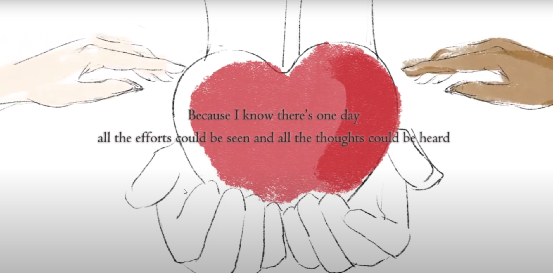
Explaination of the outro

We use colors to highlight the features we would like to express. For example, the dim blue on the left emphasizes the isolation of main character Meimei standing outside. She feels difficult to join the discussion group when she is speaking in a non-proficient second language. And the orange on the right represents another type of isolation caused by the microaggression that Asian should be good at math but ignore their efforts in doing exercises.

We also draw several key-frame animations to show some critical moments more vividly. For example, these frames express the scene that Meimei tries to speak out her ideas but they’re like bubbles bursting silently in the air without leaving any traces.
Some feedback from our instructors and client:
- Add inner thoughts to the game which reinforce the techniques the player applies or provide more information
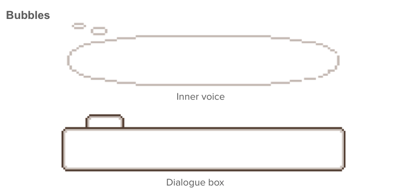
- Have cloud bubbles to distinguish conversation and inner thoughts
- How do I know as a player to drag and drop maze pieces? I’m watching them float about — not sure if I should interrupt it…
- The pieces look like yellow noodles (spaghetti).
- Consider fixing dialogue as I emailed earlier this morning to clear up some transitions (e.g., not repeating next – next and “all right” for “alright”).
- Put your spoken audio in with music much quieter for ending to deliver a read message. If that works, read the opening too, which will fix timing issues (opening text still seems a little fast to be read).
- Opening text: some of it is over a busy black-lined drawing – can you be sure that the text is over just white for easy readability (especially if that message is not read)?
Then we quickly iterated our work. From this build, we added voiceover, inner thoughts bubbles, name tags, improved playability of our puzzles, and fixed bugs.

For puzzle 1, the gray silhouette represents Meimei’s minds. So your action to avoid the text and connect the path simulates the brain activity of Meimei. At first, I use the red font and colorful curves, but we found the pic might look messy. I adjusted the font color to black, and also changed the curve color to yellow, but we got some feedback that it might be associated with worms or spaghetti, so we set it to blue in the end.

We use different bubble shapes to differentiate Meimei’s inner voices from dialogue boxes.
We also had playtesters to give us feedback.


- “Love both outro and intro cutscenes. The sound really helps build up the emotions”
- “I like the different puzzle designs you had based on different answers Meimei gives, that is a detailed but nice touch.”
- “the art is really good. And female character makes me feel more relatable.”
- “The line matching part is confusing and frustrating, it was unexpectedly hard to click and drag the lines”
- “Some dialogues could be polished to make the experience more realistic.”

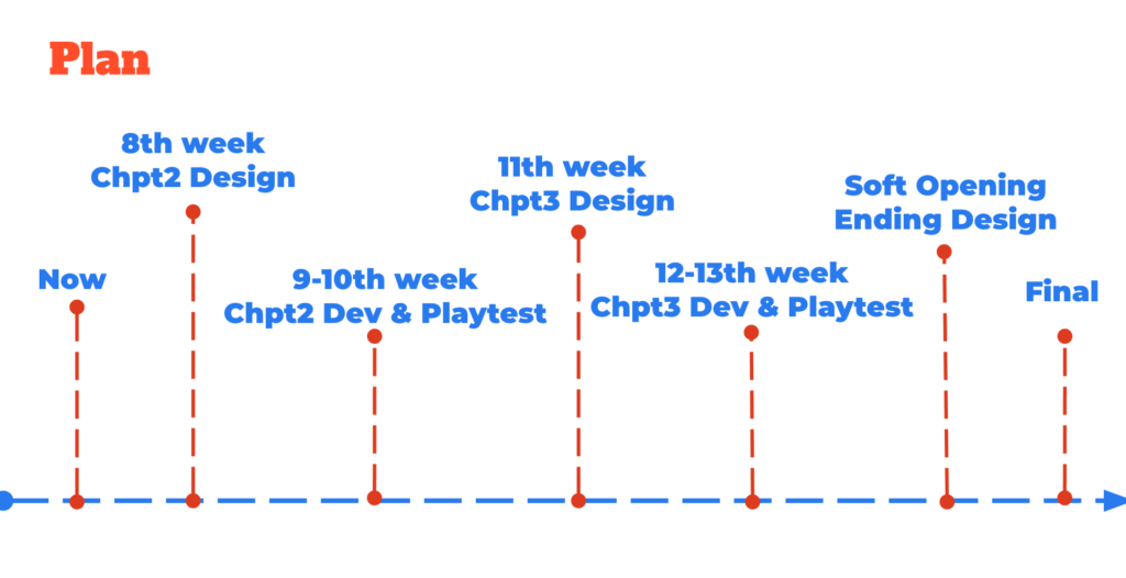
Right, we’ll have the 1/2 presentation next week. We practiced several times week. Hope our hard work will pay off! Also, we’ll design the next chapter and have more playtests next week. See ya!


Comments are closed