Week 8
Mar. 22 – Mar. 26
We decided to pivot away from showing videos of HistoryMakers, focusing instead on presenting the people and their information in a clean and playful way.
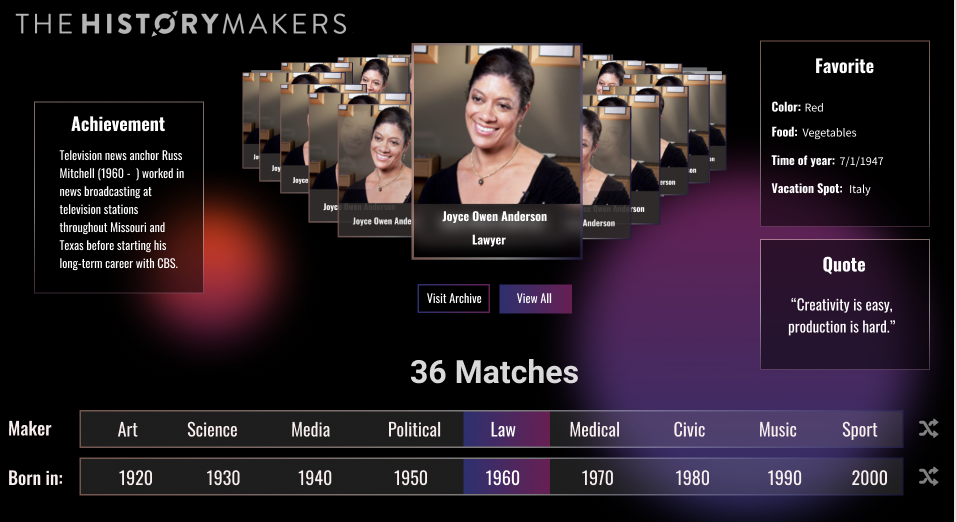
For part 1, we got rid of the projector device and made the filters flat stripes (keeping the dragging component). Knowing the ring shape and animation was appealing, we incorporated that into the presentation of the matches for the filters. The match in the center has their information displayed, and you can click through the ring of photos to see all the matches.


We also added features to make the experience more customizeable, allowing users to turn on/off filters and swap them out for other filters. Maybe you only care about HistoryMakers from the 1960s, or maybe you only care about ArtMakers from the 1960s who like the color blue. Our goal is to try to encapsulate a greater variety of user expectations and intentions because it has proven very difficult to determine a set of filters that everyone will find compelling.
One major problem we need to solve is what filters to provide the users with. Because of our scope, we are limited to what the data set has to offer. However, it seems that only a few of these available properties help users find the HistoryMakers more “relatable.” Our solution to this is to explore some way to get more compelling properties or pivot away from making the HistoryMakers “relatable” and just making an interesting and fun experience.
For part 2, we explored a few designs on how to present it as a playful data visualization, but ultimately decided to stop working on it as a strong experience equal to the 1st part, and design it as a simple flourish in the 1st part. The nature of the data didn’t support this feature very well, the interaction flow got somewhat complex (making the user experience longer), and we needed to consider how much time we had left to deliver.

Client Meeting
The client liked our new direction and encouraged us to continue with it.
Next Steps
Some feedback we got pertained to the playtest observations, which was mainly from ETC students at this point. In our remaining playtest cycles, we need to find a greater variety of testers from different backgrounds (African American especially) to ensure we are making good observations about our target audience.
We will really start polishing up the existing design (to be responsive on desktop and function smoothly on mobile) and continue iterating on the extra flourish to add.

