Week 13
Apr. 26 – Apr. 30
Progress
This week was our softs presentation (Monday), where we presented an operational version (1.0) to the faculty, answered questions, and took their feedback.
The major addition over the weekend before was this loading page, intended to smooth the entry into our experience, since it takes some time to load our assets. It’s also an opportunity to subtly guide the user’s exploration. One measure of our success is if a visitor comes away with interest in a person they did not know before, so we are workshopping the current tagline “Quickly explore thousands of African Americans” to encourage them to explore with that kind of purpose.

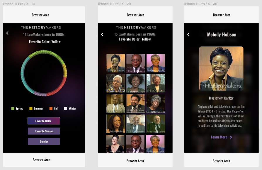
The layout changes implemented in the desktop version last week were added to the mobile version as well. I haven’t been tracking the mobile development very closely on this blog since most features added to the desktop make their way into the mobile the following week, but this is a quick overview of what was implemented for softs:


Our feedback from softs was very positive. Many faculty commented that it felt very polished and engaging. The fact that people said they wanted to keep clicking (we were able to let them try it on their own devices) was a huge win for us. While our feedback from our 20-29 year old playtesters has not been quite as strong as this, we have not tested our latest (and least buggy) version yet and the faculty feedback at least means that our iteration on the “playful interaction” was a success.
The work after softs for designers was modifying the typography and fine tuning the design, as well as making one last design to give more functionality to the mobile version.


The programmers’ work this week was implementing this last feature, fixing bugs, polishing the layout across different screens, and cleaning up the code for the code review with our instructors and members of the client’s tech team on Thursday. They are also working on writing documentation for the handoff.
The Spring Festival (or Virtual Open House) is next Friday, so we spent some time creating content to help present our work on the virtual platform that will be used. We also have started to work on other final documentation work, such as a design document, project video and trailer, and archiving our project website and assets.
Code Review
After some discussion with the client’s tech team, we did a code review with our instructors and other faculty familiar with the HistoryMakers. Everything looked good, as we did not use many libraries without long-term support and kept the deployed version simple (using webpack), so we were ready to move forward with . This is handled by an ongoing exchange between our team’s programmers and the client’s tech people.
Next Steps
After the code review, the timeline was shortened to make sure the team had time to address any problems that arose during the handoff process. As a result, we aim to deliver the final product (no more changes after this, unless it’s a bug fix) to the client at our next client meeting (5/4).
