Week 10
Apr. 5 – Apr. 9
Progress
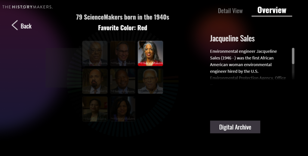
By the middle of the week, we had all the styling and functionality implemented for all parts. There were some design changes, including keeping the dark background across both tabs, changing the style of the button, adding a popup for the Digital Archive button to inform users that they would be leaving our experience, and redesigning the details show in subset view.
Our experience now has the following parts:


The bulk of our focus this week was on producing a playtest ready prototype, so further development and design of the mobile version was not pursued.
Our playtesting goals related to usability and transformational impact. We want to test our interface to see if it presents information in an engaging way and encourages exploration. We also want to see if the experience curve results in users feeling more interested in the Digital Archive afterward. The standards we are using to assess this include (ordered by increasing inpact) (1) whether or not the user found a person they were interested in using the filters or data visualization, (2) read information such as their description and favorites, and (3) visited their biography page.
Client
This week we demoed our progress for other members of the HistoryMakers organization. They were pleased with our direction and thought the experience was an engaging transformation of their content. We received some feedback about adding more to the interface to make it a more powerful visualization/searching experience, but we had to push back on that and reiterate that our focus was on distilling the archive functionalities so it can be more appealing to 20-29 year olds.
Next Steps
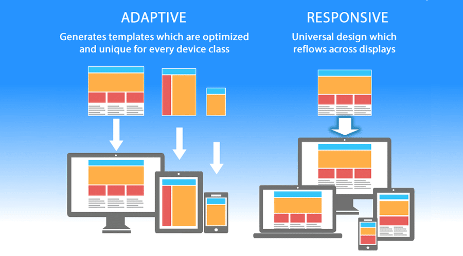
Next week we will look more carefully at responsive design (right now the design is implemented in an adaptive way) that we can have a foundation set up to iterate on the layout more efficiently. For example, changing the font size, style, and weight currently can result in elements being moved around, and we want to avoid that. On the programmers side, this requires some refactoring of CSS and HTML and on the design side, this will involve some redesigns of the layout.
We will also begin some kind of documentation of our use and manipulation of the data from the HistoryMakers Digital Archive database, so we can potentially start to make needed changes before we begin the final hand off stage. For example, our sorting of states into “regions” was unclear, so a solution is to use the categories used by the official U.S. census data, and denote that in the document.

