Playgrounds: Week 6

Week Six found the team solidifying design and working on our foundation.

Preliminary design continued this week on multiple fronts. For the designers, this meant continuing to develop and iterate on the Vocal User Interface, or VUI. Finding a natural, intuitive way for the Assistant to interact with guests will be vital for the project’s success. As we’re using the standard SDK, the two ways we’re focusing on improving the guest interaction are by shaping the questions to lead the guest towards specific categories of words, and also by increasing the Assistant’s vocabulary. The first task has meant iterating on questions, and understanding the difference in user reactions when asked about their favorite movie, verses their favorite genera of movie. The second has involved finding and curating lists of hundreds of nouns and adjectives, and making sure they fit into the properly detected areas of speech in Assistant’s Dialogue Flow.

Of course, none of this will be usable if we can’t establish our infrastructure first. The team’s programmers are working on getting our databases up and running. Beyond parsing the pieces of language, it is also vital that we have a large base of drinks to pull from. Making sure this database of drinks is accessible by Dialogue Flow is essentially our core guest interaction, and requires several different pieces of software to communicate as well.

The good news is, once these tasks are finished the first time, they will scale with significantly less effort. Even though our end goal is six different sets of modular conversations, we are beginning our design focusing on a single conversation about the guest’s favorite genera of movie, and selecting drinks based on spirit and flavor. If we can get this model up and running, expanding and iterating on it should go much faster than raw construction.

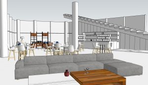
Our client meeting this week helped us realize a blind-spot in our design; operations. The team has spent so much time refining the through-line of the experience, we hadn’t given much thought into how Toast Master would fit into the physical space. Buoyed by the idea that our fleshed-out user experience was meeting with approval, we are now adding focus to physical details ranging from signage to the design of the bar that Toast Master may be house in.

With three weeks until our Halves presentation for the assembled student body, we understand that timing is tight. However, still on schedule and with our most difficult work already underway, the team is optimistic about what we can achieve by the end of the semester. Next week will be focused on developing the holistic view of the experience, playtesting, and getting our collected databases up and running.
 

Playgrounds: Week 5

Week Five found the team diving into production in earnest.

Following out client’s request, we took a deeper look into our concepts. What we found surprised us; the distilled essence of the room-scale experience and the magic mirror were not as appealing as we had hoped. With the showmanship stripped away, their fundamental interactions didn’t support Google’s internal message, or add to the day of an Experience Center in a meaningful way.  It looked like these two ideas were dead-ends.

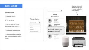
The good news was that, when we looked deeper into the cocktail hour experience, we discovered there was a significantly larger design space there than we had previously though. With this in mind, we pitched a fleshed version of the Toast Master experience. The client was very happy with our direction, and production began.

All aspects of the team immediately began working towards the groundwork we’ll need for the rest of the semester. Yevette, our artist, began preliminary visual design, laying down the visual vocabulary that we’ll be drawing from. Atul and Ray, the programmers,  began researching and constructing the databases that will be the foundation of the experience. And Alan and Tera, our designers, began hammering out how, exactly, the guests will be interacting with the Assistant.

The first steps of this design were presented to ETC faculty at Quarters. Serving as formal check-ins, all faculty visit all of the teams at Quarters to see the current state of how projects are advancing. Playgrounds’ major feedback centered around the user experience; making sure it is intuitive, delightful, and interesting.  While these were not new ideas for the team, seeing them reiterated by faculty helped drive home how important they truly were.

The back half of the week was centered on research. The team interviewed interview six students, and two bartenders, about their take on the true bar-going guest experience. We were also able to sit down with faculty member Heather Kelly. An award winning cocktail roboticist , she had excellent advice for how proceed with initial design. She was able to point us in the right direction regarding scope, and give us tips on how to being addressing the guest experience.

Playgrounds is now moving out of the hypothetical and into the real. While we are still on schedule, timing is tight and productivity will be vital. With initial design continuing into next week, we absolutely have our work cut out for us.


Playgrounds: Week 4

Week Four found the team narrowing down our broad ideas into actionable ways forward.

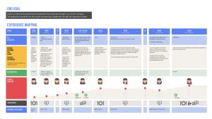
Most of the week was spent preparing our pitch to the Google Experience Design team. With our heads full of ideas from our time on the Google campus, the team started figuring out how to marry concepts we had previously created into Google identity. The first step in this process was mapping out the guest experience, and understanding the arc of the interest curve as it stood for current guests at the Mountain View Partner Plex. We were able to do this using a sample agenda provided by the Googlers.

Once the interest curve was clearly visualized, we were able to see what areas of the day could benefit from additional interaction, or just from grander use of technology. That informed our design even further; knowing what pieces were meant to wow, and what pieces would facilitate quiet smoothness, went a large way towards shaping ideas.

Final pitch ideas included narrative interaction with a machine learning powered character inside of a mirror, drone butlers for cocktail hour, finding uses for underutilized room-scale technology, and a machine learning bartender.  These ideas combined the desires that client had expressed to feature AI/ML, while still allowing for conversations over the current or future applications of the technology to emerge naturally through use.

After getting the ideas vetted by our project advisers, we presented our pitch to the client. The good news was, they were intrigued by three of the four ideas we presented; while convincingly presented, the drones turned out to be an idea they feared their stakeholders would not be on board with. It became clear, however, that Playgrounds had missed an aesthetic component while working on our design; Google’s trademark simplicity.

Moving forward, the client has asked us to pare down the mirror and room-scale interactives, finding their core interaction and distilling it into a simple, engaging, and meaningful experience. The ML bartender showed promise as it was presented, but there was a request to find one more “something special” about it to develop further.

While the exact details of these interactions may still be up in the air, the team’s deliverable has been solidified. We will be delivering one functional prototype at the end of the semester, along with a style guide complete with all of the design information we have uncovered regarding all three design ideas. By Wednesday of Week 5, we will know for sure which prototype we are pursing.

Even though there are still some uncertainties ahead, Playgrounds has a much better idea of what we are building, and why. Heading into Quarters next week, we feel prepared to explain our goals, process, and design. And then, all we have to do is build it. Which, it’s worth mentioning, the team is fired up and ready to start.


Playgrounds: Week 3

Week Three found the team exploring possibles in San Francisco.

Monday and Tuesday functioned as our final prep before our client visit. Beyond continued efforts on our Gold Spike, we also brain stormed further ideas and concepts to take with us. With eager minds, we boarded a plane before dawn on Wednesday morning.

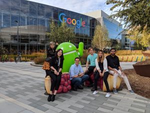
Wednesday, Thursday, and Friday were a blur of travel and absolutely vital conversation with our client. By noon on Friday, we had spent nearly twenty hours in direct conversation with the Google Experience Design team. We were able to make the most out of in-person visits to multiple existing Google experience centers, see behind the drywall on one site still in construction for a better understanding of installation, and leverage multiple direct conversations with relevant Google employees from multiple strata of the company.  While much of the specifics would considered covered by the team’s NDA, it is very easy to say that both the Googlers and the team wanted to make sure we got the most out of our visit.

The biggest thing that the team took home was a focused understanding of what we should be designing. Ranging from a deeper understanding of past experiences, the current scope of installations in various centers, or how targeted interactions may work moving forward, the information the team was able to process will be seen in every aspect of our future design.

With Quarter Reviews looming in two weeks, our task now is to collect all hypotheticals we may have, and start developing a very real path forward. With only twelve weeks remaining, there’s no time to lose.


Playgrounds: Week 2

Week Two found the team diving boldly into pre-production.

Facing down a short week because of the Labor Day weekend, Playgrounds knew that we needed to work efficiently. The challenge, however, came from wanting to make the most of our time in pre-production, while still laying proper groundwork for us to move forward in design. If we became too eager to start creating, we might miss the larger points our client wanted us to focus on.

A large section of the week was dedicated to getting the Google Assistant Ecosystem up and running in our project room. The more familiar we are, the better we’ll be able to design experiences around its capabilities. The problem that we found is that CMU’s Wi-Fi does not allow for items like the Google Home to broadcast over it. This meant that we needed to install a private Wi-Fi network for the team. Once that hurdle was cleared, the rest of the hardware setup was smooth and uneventful.

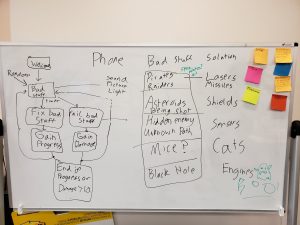
The team also began working towards a Gold Spike for the project. For those unfamiliar with the term; a Gold Spike is proof that the team can work as a unit, that the areas of design are being made in compatible ways, and that the production pipeline is flowing smoothly.  Working as quickly as we are able, our goal is to have some sort of working Assistant experience by the end of next Tuesday. Even if the experience we design for the Gold Spike isn’t part of our continued work, the lessons we learn by finding out what it takes to do a basic unit of deliverable work will be invaluable moving forward.

We ended the week with a call to our client. With a trip out to San Francisco involving multiple site vists  planned for next week, it felt important to make sure everyone was on the same page. We were able to clear up expectations as to the message our experience should be conveying, expectations on deliverables, and we had a chance to clarify what would be on the itinerary for the visit.

Even though we will not be in the office for most of next week, it is shaping up to be very busy. Being with the client, and in the space that we are expected to design for, may possibly be the most formative moments of design in our entire process.