Playgrounds: Week 16

Week Sixteen saw the team wrapping it all up.

Our presentation for Finals went well, as did our final check-in with the client. We were actually fortunate enough to have them visit to sign off on the product. They are pleased with our work.

The only other deadline the team faced this week was having to tear the room down for semester break. All of us are parting ways; some to co-ops and internships, some back into the building for their final project as an ETC student.

Thank you very much for reading along, and I hope the next semester is as much of an adventure for you as it will be for us.

Playgrounds: Week 15

Week Fifteen saw prepping for, and delivering on, the ETC Fall Festival.

The Fall Festival is a program-wide celebration of what students have accomplished throughout the semester. Students in the Immersion Semester get to showcase their work from their classes, and students on projects get to show of their deliverable. Before we could present at the Festival, however, we had a major issue that needed addressing.

It turned out that our audio fix was much more complicated than first expected. The initial idea was to replace the instances of speech to text with sound files. As we were already familiar with a similar process for our sound effects, we did not expect this to be an issue. However, by bypassing the speech to text, we accidentally cut out the programming that allowed for the microphone to turn on to accept guest vocals. What was intended to just be plugging in new assets turned into a structural re-figuring of a portion of the code.

Even with that extra work, we were able to get ourselves in shape for Festival. The night saw around 500 guests in the building, with nearly 100 coming through our room. The light-hearted, party atmosphere was an amazing chance to playtest our use-case. The good news was, it worked. Guests found the writing amusing, the interacting engaging, and the drinks at the end fun. Having been so close to the project for so long, it was good to that the naive guest response was overwhelmingly positive.

The tail end of the week was spent collecting ourselves for Finals. As the last chance to explain our process and product to the faculty and student body, we want to make sure we accurately capture the last fifteen weeks of our efforts. With only fifteen minutes allotted for our presentation, we’ll need to be as clear and concise as we can.

It’s been an exciting semester. Now it’s time to put it to bed.


Playgrounds: Week 14

Week Fourteen was a week of seeking out and implementing our final feedback.

Monday was Soft Opening, a chance for faculty to come around to student products before they’re formalized and offer final pieces of advice. The team had the opportunity to demo our experience six times for different groups of faculty, and receive feedback on topics ranging from our writing, to lights implementation, and overall experience design.

Feedback on our physical design was  positive, with comments about how the built table and lights greatly added to the experience. We did receive critique that the meaning of our lighting was not quite clear enough. Our scripted content was the subject of most of our criticism. The robotic delivery of the voice, due to the fact that Lenovo tablet does not support dialogue altering SSML, was not allowing for our jokes to land, and was actively working against us.   Because of this, faculty let us know that they were having issues engaging with the experience.

The feedback from Monday shaped how shaped our final week of design.  Programming and Design made a solid push to clarify lights. The script was shortened by a full question, and our dialogue issue was discussed with the Google team.  Even though the software that we had been working with did not have the capability to address the issue, they worked with us to find a fix. Using the Google team as points of contact, they were able to develop audio for us using internal experimental software. While it was not a perfect  fix, it has gone a good ways towards addressing issues with the speech.

On Wednesday, we checked in with the client to make sure we could implement Softs notes in ways they found agreeable, and on Friday, we had our final call. As we continue to polish towards our final delivery, we can breathe a little easier knowing the client is happy with out work.

We’re in the home stretch, and still need to finish strong. Next week, we take the experience public at the the ETC’s Fall Festival, and the week after, we present at Finals for the collected body of the ETC.  It’s been a long semester, but we’ve got things to show and be proud of.

Playgrounds: Week 13

Week Thirteen was a strange and scattered week for the team, but work still got done.

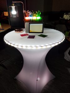
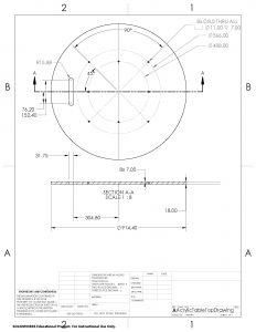
The most tangible progress this week came from construction of the physical side of the experience. To make the most of our our smart light ecosystem,  we designed a costume acrylic table top, and had it manufactured at a local fabrication company. The fabrication, as well as Alan’s initial design specs, went off without a hitch, and the acrylic top bolted onto our table base without a problem.

The next step was making sure our theoretical lighting design fit on our very real table. Some of the work came from programming matching color codes for the selected looks, and coding in the patterns and interactions that we wanted. Other work work came physically attaching the lights to the table, making sure to find the feeling that we wanted without making the table cloth look too sheer, or having too obvious of lighting hot-spots. And the rest of the work came in reconciling those two efforts into one coherent lighting design.

Physical fabrication also extended to the dressing found on top of the table as well. To house the four chest-level bulbs we wanted to use, plans were drafted for a small wooden planter. We took that design laser cut it, stained it, and glued together in our shop. Artificial grass and flowers were added to complete the feel.

Programming’s work was no less important, but a little more frustrating. With a hard deadline of Monday, our programmers began hunting for bugs. Because we’re working on relativity new hardware, and brand new software, figuring out what’s broken down and where to fix it has been challenging. They are continuing to work, and the project is continuing to improve.

The holiday on Thursday has put an extra crunch on the time the team has available, and we will be working through the weekend to make sure that we have something to show on Softs. But we are making progress, and we’re excited to see what we end up with.


Playgrounds: Week 12

Week Twelve was not an exciting week for the team, and that was exactly what we needed.

One of the key happenings this week was faculty coming to the room to give feedback. This was beneficial not only for them to see the progress we had made in the last two weeks, but also to make sure we could get their notes before we needed to lock our content and focus on implementation. Because of our late pivot at Halves, we knew that leaving enough time for implementation would be key, but we also understood that making a product without implementing as much feedback as possible would defeat the point.

We were fortunate to have faculty members Jesse Schell and Dave Cybula spend time in the project room discussing our interaction design, while Ruth Comley and Mike Christal were able to give us feedback about better use of our hardware. Heather Kelly and John Dressler were also able to review our experience from a more holistic view. In addition to faculty, various other visitors to the building were brought to the project room throughout the week to test with naive guests, and get feedback from a non-academic perspective.

Taking these notes, the team was able to spend the back half of the week beginning our content lock. The script will be locked over the weekend, allowing interdependent design already in process, like art and lighting, to be finalized by Wednesday. Constructions schematics for our specialized table top have been sent in for fabrication expected Monday, and physical printing for our table cards is set for Tuesday. Baring what’s being fabricated, all the hardware we’re going to need for the experience is in the room, and we are prepared to work on it, with it, or assemble it.

As things are taking shape, we still acknowledge that time is very short.  With the holiday next week, and Soft Opening on the 26th, we’ll need to use every moment that we can.


Playgrounds: Week 11

Week Eleven was, ideally, the last time the project will be seen by the team as a collection of independent pieces.

With an understanding of the core interaction we wanted to build on, the week began with the programmers rolling the work forward, back to the build we were forced to abandon before the software update on the tablet.  As this software is new to us, early access, and existing documentation is slim, there is a bit of a feeling of being pioneers. A large portion of that feeling come from how we’re trying to use the software.

Aiming for an engaging and fun experience, we’re going above and beyond the basic interaction interface. By integrating Phillips’ Hue API,  we’re adding an additional layer of magic and unexpected interaction through five different color-changing smart bulbs. We are also adding multiple additional pieces of hardware to be considered, and an additional layer of programming that needs to be created. Adding sound effects into the software is not inherently difficult, but it adds questions like what is being called, how that effect is being called, and where all of those effects are being stored.

Physical design worked hand-in-hand with programming this week, making sure that our code fit our layout, and that our aesthetic supported the experience, instead of working against it. Lamp height, placement, use, and whether they should be for the active guest or the audience watching were all decided this week.

Of all of the things that were changed due to feedback from Playtest-Weekend, the script saw the most fluctuation. This was because overall feedback was that the experience felt like the correct length, but that the assistant spoke too much. Or initial response was to shorten all of the text, but that ran into issues with preserving the humor. A new option available to us can be found with the smart-tablet software; we are now able to split up out text into more bite-sized chunks. Our current round of testing is to see if the smaller pieces of text over time makes the exchange more palatable.  We were also able to sit down with Brenda again to check our progress on dialogue.

Art shifted this week as well, though not from playtester data.  Previously, we had been using the Android mascot in the art. Our reasoning had been that it would avoid any issue of gender or race for the viewer to use the figure as a self-insert into the questions. However, on Google’s request, we have removed the figure to prevent any kind of brand ambiguity between Assistant and Android. Yvette is taking the weekend to decide on the artistic style moving forward; either focusing on key items or ideas from the questions themselves, or replacing the Android figure with more broad, human style of figure that Google uses in some of its other art.

Alumni Walk-Arounds turned out to be far more low-key than expected. Only four alumni made it to the third floor, where the project room is located. Interactions focused mainly on conversations around design, though we were able to demo a basic run-through for those interested.

Our goal now is to integrate all of the component pieces. Next week is going to be looking at the project holistically, and figuring out what integration we need from there.  It will be hard work, but we are starting to see it come together.


Playgrounds: Week 10

Week Ten was a week of elbow grease. Our new direction may have been better defined, but we now only had a week to implement it into a functional build.

That deadline came from the bi-annual ETC Playtest Day. On Saturday, the ETC would be inviting nearly 70 guests into the building to playtest the current student projects. If we wanted to take advantage of Playtest Day, it meant that we needed something to playtest.

Monday was a day of regrouping and reevaluating. Even though progress had been made late last week, making sure the team was on the same page was essential. Through focused conversations and meetings, roles were clarified and our goals for the week were made clear.

Yvette began working on visuals for the new format, keeping in mind Google’s brand requirements, and the project’s aesthetics. Visuals were designed to function as both feedback and fallback. Taking advantage of the touch screen, the images displayed will work as buttons to confirm choices. While the vocal interface is still our primary goal, designing graceful and subtle ways to assist the guest will help guest avoid frustration in any context.

Alan, Axel, and Tera began developing content as quickly as possible. Tera’s focus was on the over-all experience, with an emphasis on the designed environment. Diving into things like how we’ll be using lights for visual feedback, proper table distance between set-up smart tablets based on decibel testing, and how attract screen and initial moments of the interaction would go, Tera began working on the project from the top down.

Alan and Axel started working from the bottom up. With an emphasis on trying to find engaging and funny dialogue, they started drafting scripts. The idea was to find what worked by creating a large volume of work, and stripping away anything that wasn’t worth keeping. By Friday, they had created five full versions of a workable script.  While still a very rough draft, it could be implemented.

As programmers, Rey and Atul had their work cut out for them. Taking all of the knowledge and foundation that had been laid previously, they began building. With early access to software allowing us to create more detailed experiences on the tablet, they began to shape the experience into what we wanted it to be. The problem came when we realized that the software update to make the program actually run on the tablet wouldn’t be installed until Sunday. To make sure we still had something to test, they rolled back to our previous version, and redoubled their efforts to make sure we didn’t lose time.

The team also made sure to consult as many subject matter experts as we could while we still had time to be malleable. On Monday, we spoke with Dave Culyba about how to manage a cohesive design going forward. Tuesday was Chris Klug, consulting directly and content and writing direction. Wednesday was Brenda Harger, getting advice on how to shape guest interaction and find a driving interaction arc. Thursday was speaking with Jesse Schell on how to best approach the comedy.

Friday was work. Time was short, and the team buckled down to make sure what needed to be done got done.

Playtest Day went well. With just shy of 40 guests coming through our room, we were able to give each of them an experience hosted on the smart tablet, using integrated lighting, with an interaction that resulted in receiving a custom made, non-alcoholic drink.

The good news was we didn’t have any major surprises; the areas we knew were weak got notes from the guests, and what we had hoped were strong got reinforcement. One of the proudest moments for the team was two women stating that this was the first time they had every felt comfortable using a voice assistant, and the first time they had actually enjoyed themselves with one.

Our work is still far from done. We have a clear next deadline with Alumni Walk-Arounds this coming Thursday. We have a base interaction; now we need to iterate it into something more polished. But, with only a week under our belt in this design direction, the team is still taking pride in what we’ve managed so far.

 

Playgrounds: Week 9

Week Nine was a week of taking the note. It was not particularly easy, but we are better for it.

Halves Presentations were a large portion of the week. With twelve project teams presenting, they covered the full afternoon of both Monday and Wednesday. Going on Monday, we offered our initial pitch: A guest would volunteer a movie, which Assistant would pull a genera from, and then use that genera to determine a base alcohol.  How the guest felt about the movie would provide a color. Using those metrics to draw from a drink database, the guest would then be given a drink. After the second day of presentation had concluded, faculty convened to give feedback to each team.

Our feedback from Halves was not what we were hoping for. Faculty doubted the viability of such a programmatically dense system. Beyond that, there were concerned about the transparency of a system like that. Even if we could explain how 101 Dalmatians lead to a Mango Daiquiri internally, the system stood no chance of making sense to a naive guest going through an experience with less than a 90 second dwell time.

Possibly the most damning critique was that we had lost the fun. In an experience that was supposed to surprise and delight, we had spent so much time focusing on the tech that we had neglected the detailed design of the experience.

This was sobering for the team. However, we did not come here to fail.

After hearing the news, the team rallied,  regrouped with our advisers, and figured out a new direction. Taking Thursday to lean into our content pivot, we began exploring a new direction. Instead of going for a more technically impressive, free flowing conversation, we began developing a tighter, more enjoyable experience. Assistant is no longer going to pull your drink out of thin air in a technological magic trick; to get your drink, you now have to spend some time letting Assistant get to know you.

By creating questions for Assistant to ask and for the guest to answer, we began to leverage what makes the Google Assistant so fun; its personality.  Additionally the back and forth can be used to collect information directly from the guest’s experience, allowing for a much clearer connection. If your answers to questions could be seen as confident and adventurous, being told that your drink was selected for you because Assistant thinks it’s a good match for your confident and adventurous personality has a direct personal connection.

Though we were working with little time, we fleshed out a start-to-finish paper prototype of the idea to pitch to the client team. There response was heartening; it had the tone and feel of what they wanted. We were also able to discuss what a way forward might look like using this design, and ways to check in as we started down this design path, to make sure we didn’t loose our way again.

We have a long way to go. But at least now we know we’re on the right track.

Playgrounds: Week 8

Week Eight found the team playtesting and preparing for halves. While that may seem like a simple sentence, it was anything but.

Halves are supposed to represent both what the team has done with the first half of the semester, and the process that got them there. Doubling as practice for presentations we’ll have to do in our professional lives, Halves are presented in front of the collected student and faculty body of the ETC, as well as live streamed for any clients who would like to watch. There is a strictly enforced fifteen minute time limit on all presentations, and professionalism is paramount.

Fitting eight weeks of intense cross-disciplinary work and research into fifteen minutes has not been easy, but the team has done a marvelous job finding the important pieces of our process to highlight. Honesty is paramount; we are making sure to include details on how we’ve improved on our failures as well as talking about our successes. We are, after all, still students. Presenting to faculty is about more than just bragging about the work we’ve done, it’s about making it clear that this process has been something that we’ve grown and learned with, and that that growth will continue into the back half of the semester.

Beyond collecting content, creating our slide-deck, rehearsals, and critiques from our advisers, the team has made a concentrated effort to not let design fall by the wayside during the week. Iteration came into sharper focus this week with intense focus on playtesting and interviews.

The playtests this week took the form of paper prototyping. It was a choice that let programming focus on making sure everything was running as it needed to, and design test the experience as a whole. We managed to test with fifteen different individuals over three different full-length interactions, following each interaction with a detailed debrief. The test was vert heartening; a lot of our design choices were validated through the guest reactions; use of humor, naturalistic bounce-back statements, and focused questions were all very successful. We also discovered several distinct areas that we need to improve; there is still an unnatural feeling to the conversation, and the cause and effect of questions to resulting drinks is still unclear. The data we were able to gather will help shape the next iteration of the experience in a substantial.

Three key interviews this week were with the Googlers who run the Experience Centers; Erika Brunke, Jess Golden, and Meggie Coates. Because so much of our testing and research has been done with folks outside of our key demographic, these interviews were an incredible opportunity to look directly into what time at the Centers is like. We were able to get information that helped us refine our discussion topics, understand preferred use cases, and even get perspective on what things we could design towards to make lives of the folks who run the centers easier.

Our client call this week was an excellent reminder about our core goal and topic; we need to make sure we create a delightful and surprising experience. All of the information that we’re taking in, and the design that we’re making, needs to lead to that final outcome.

The team will be putting in work this weekend to prepare for halves, and to begin implementing the changes that we identified with our playtesters. Even with that in mind, things are looking on track. We a Monday presentation coming down the pipe quickly, and half the semester behind us, we know what we need to do. The hard part now is just to do.


Playgrounds: Week 7

Week Seven found the team exploring operational ideas, and dealing with the resulting chaos.

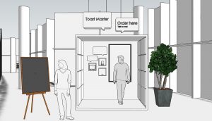
On the suggestion of our client, we started to dig deeply into how Toast Master would exist in, and interact with, the physical world. By drafting out our ideal use of the physical space, and outlining the guest journey from entering the area to successfully retrieving their drink, we began to see how the whole experience might take shape.  The good news was that we now had a better understanding of how our interaction would work. The difficult news, but still beneficial for design, was starting to understand the holes and impracticality of our initial plans.  While our over-all experience withstood the test, our details were thrown into disarray.

This high-level/low-level split was made even more clear by time spent with visiting professional Anthony Daniels. As someone who had had nearly no exposure to our project until the moment he walked into the room, Mr. Daniels was an excellent proxy for a naive guest. Speaking through our interaction with him was eye-opening. The two things it became apparent that we needed to clarify were why Toast Master was a preferable experience to just going to a human bartender, and what the button of our experience would be. He also provided a good amount of insight over the fact that even though our experience is focused on cocktails, the end goal is the human interaction.

Examining our design ideas also made us examine our ideas of a functional pipeline. Much of the work this semester has been done in parallel, in an attempt to save time. However, looking at what has been done and what still needs to be done, the team has reached the conclusion that trying to do everything at once is only leading to muddy results and conflicting processes. Our new approach is going to be a more inside-out design. Programming will have less constraints on the content that they’re using, and more freedom to do what they need to to get the architecture up and running. Design will carry foreword with paper prototypes, allowing the content to be rapidly prototyped without bogging down the programming team. Once both sides have a firm idea of what they want to do, we’ll begin bridging the gaps between the two, making sure that the experience fits the technology, and that the tech best serves the design.

This choice is showing immediate dividends. With a single sample interaction to focus on, programming now nearly has a complete system up and running. The exact interaction is far from polished, but that’s not what’s important at the moment. This basic interaction serves as a proof of concept that we can interact with the software in the way we want to.

Without the need to worry about selecting specific data to be used, design’s focus shifted towards an issue that came up while considering operational issues: Toast Master was functioning both as facilitator and gatekeeper. To facilitate well,  it required an engaged conversation. But, to be able get drinks quickly, the requirements shifted to speed and efficiency. Coming back to the idea of pulling on human interaction, design has shifted focus on the experience to facilitate conversations about AI. While drinks are the vocabulary we’re using to start that conversation, they shouldn’t be where our focus lays.

Research continues to try and find the best interaction between the hardware and guests. We’ve begun testing Assistant’s ability to pick up voice in noisy environments, seeing how we might be able to incorporate Toast Master directly into the dining environment. We’ve conducted further interviews leading us with case studies for us to base personas on, and we’ve begun paper prototyping the dialogue as well.

With Halves only nine days away, we need to start focusing on our Alpha build. While Halves tends to be process focused, we need to show that our idea has merit and can be delivered on is vital. With an operational prototype on schedule for Monday, we’re going to need to test and iterate quickly to make sure we can justify our choices.